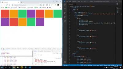
repeat(<n>, <size>)
- 반복할 횟수(n)와 사이즈를 받음
- size에 단위(fr)을 쓰면 알아서 빈공간 채워줌

minmax(<min-size>,<max-size>)
- min-width, max-height 와 비슷
- 반응형 웹페이지를 만들때 사용
- 웹페이지가 resize될 때 최소값을 줌으로 레이아웃 유지
- 최대값은 fr을 써서 넓은 화면에서 빈공간 없도록 함
minmax 사용 안했을 경우

- 100px로 최솟값은 유지하지만 넓은 화면에서 오른쪽 빈 공간 발생

- 빈공간 채우기위해 1fr로 하니 좁은 화면에서 찌그러져서 레이아웃 망가짐
- 내용 overflow될 가능성 많음

- minmax로 최솟값을 유지하면서 꽉채움
- 그러나 좁은 화면에서 최솟값때문에 스크롤 발생
- 자동으로 줄바꿈되길 원할 때 auto-fill, auto-fit을 쓰면 됨
auto-fit
- 반복할 횟수(n)에 들어감
- 주어진 사이즈로 채울 수 있는 만큼 자동으로 채움

auto-fill
- 반복할 횟수(n)에 들어감
- 주어진 사이즈로 채울 수 있을만큼 자동으로 ghost-grid를 만듬
- 미리 틀을 만들어 놓고 채울 수 있으면 채우는 방식

- 사실 이렇게만 보면 큰 차이를 모름
- 반응형 웹페이지를 만들면 차이점이 더 잘보임
반응형 auto-fit

- min-size를 유지 못할만큼 웹페이지가 좁아지면 자동으로 줄바꿈

- 넓은 화면일 경우 채울수 있을 만큼 빈공간 없이 채움
반응형 auto-fill

- 좁은 화면일 때는 auto-fit과 별 차이 없음
- 넓은 화면일 경우 빈 공간 발생
- fr로 꽉 채워주라고 했지만 꽉채우는 것은 ghost-grid가 채움
- 눈에는 안보이기 때문에 결과적으로 빈 공간 발생
결론
- auto-fit, auto-fill 별 차이 없음
- 다만 1줄일 때 width가 1fr이면 auto-fill은 빈 공간 발생
- 개인적으로는 빈 공간 없이 꽉채워주는 minmax, fr, auto-fit 조합이 제일 많이 쓰일 것 같음
'Frontend' 카테고리의 다른 글
| 순수 JS로 모듈 컴포넌트 만들기 (0) | 2023.06.12 |
|---|---|
| Redux test를 위한 export, default export 구분 (0) | 2020.11.08 |
| CSS 세로로 글쓰기 (0) | 2020.04.02 |